

Klaviyo Benchmarks Explained for Ecommerce Marketers
TL;DR:
- Klaviyo benchmarks compare your email and SMS metrics against similar ecommerce brands using anonymized peer groups. Prioritizing flow optimization and revenue per recipient helps improve key performance indicators and drive revenue growth effectively.
A Klaviyo benchmark is an anonymized, peer-group performance comparison that shows how your email and SMS metrics stack up against similar ecommerce brands. Klaviyo pulls data from over 183,000 customers and groups you with roughly 100 brands that match your revenue, average order value, growth rate, and sending behavior. The result is a comparison that actually reflects your competitive reality, not some blended average across every Shopify store on the internet.
Three things to do right now:
- Check eligibility. You need at least 25 emails sent in the last six months before benchmarks appear. If you just started, mark your calendar for the month after you hit that threshold.
- Find your weakest KPI. Benchmarks are most useful when you treat them as a diagnostic, not a report card. One lagging metric usually explains most of the revenue gap.
- Prioritize flows over campaigns. Automated flows consistently outperform campaigns on revenue per recipient (RPR) and placed-order rate. That’s where the leverage is.
Table of Contents
- What do Klaviyo open rate benchmarks actually tell you?
- How do click rate benchmarks differ between campaigns and flows?
- Revenue per recipient: the benchmark that actually drives decisions
- How does Klaviyo measure placed-order rate?
- Where do Klaviyo benchmarks show the most leverage: campaigns or flows?
- How do you access Klaviyo benchmarks and what are the eligibility rules?
- How does Klaviyo calculate benchmarks: peer groups, sample size, and percentile statuses
- How do you interpret benchmark results and prioritize improvements?
- A step-by-step plan to move from average to excellent in Klaviyo
- Key Takeaways
- Benchmarks are a decision tool, not a vanity stat
- Your Klaviyo benchmarks need more than a monthly check-in
- Sources and further reading
What do Klaviyo open rate benchmarks actually tell you?
Open rate is the metric most marketers look at first, and it’s also the easiest to misread. Klaviyo reports open rates separately for campaigns and for the initial email in each automated flow, which matters because flow open rates tend to run higher. A welcome email sent minutes after signup will almost always outperform a promotional blast to your full list.
Industry ranges vary meaningfully. Apparel and beauty brands typically see campaign open rates in a moderate percentage range, while B2B-adjacent verticals can push higher. The 2026 benchmark report breaks this down by vertical, so you can see where your industry sits rather than comparing yourself to a cross-sector average.
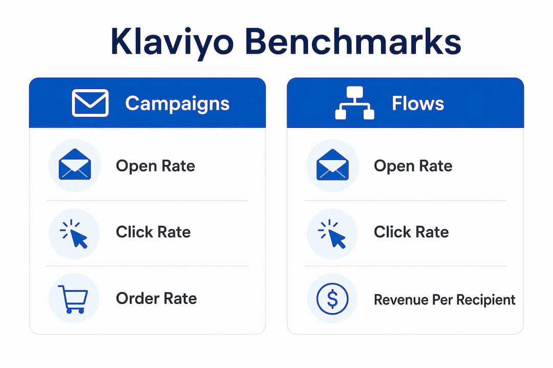
| Metric | Campaign (typical range) | Flow initial email (typical range) |
|---|---|---|
| Open rate varies by benchmark category and tends to be higher for flows than campaigns. | ||
| Industry spread | Varies by vertical | Higher for high-intent triggers |
When your open rate is below the median for your peer group, the first question isn’t “should I rewrite the subject line?” It’s “is this a deliverability problem or a relevance problem?” Check your spam complaint rate and sender reputation first. If those are clean, then subject line testing and send-time optimization are the right levers.
Pro Tip: Before A/B testing subject lines, verify your sender domain is authenticated (SPF, DKIM, DMARC). A deliverability issue will suppress opens regardless of how good the subject line is.
How do click rate benchmarks differ between campaigns and flows?
Click rate is where the gap between campaigns and flows becomes hard to ignore. Klaviyo defines click rate as unique clicks divided by delivered emails, and flows consistently outperform campaigns here because the audience is self-selected. Someone who triggered an abandoned cart flow already showed purchase intent. A campaign recipient may not have.

Practical ranges to orient yourself: Campaign click rates are generally lower than those of high-performing automated flows, reflecting typical performance differences between campaigns and flows. Top performers, those in Klaviyo’s “Excellent” tier, tend to sit well above the campaign average. The multiplier between a well-built flow and a standard campaign can be substantial.
If your click rate is below your peer group, run through this checklist before touching the design:
- Single, clear CTA. Emails with multiple competing links dilute clicks. One primary button beats three secondary ones.
- Segmentation. Sending the same email to your whole list drags click rate down. Segment by purchase history, browse behavior, or engagement tier.
- Product recommendations. Dynamic product blocks tied to browsing or purchase history consistently lift clicks over static product grids.
- Mobile layout. A CTA button that’s hard to tap on a phone kills clicks. Test on actual devices, not just desktop previews.
- Send timing. Even a 2-hour shift in send time can move click rates for certain audiences. Check your analytics for when your list is most active.
Revenue per recipient: the benchmark that actually drives decisions
RPR, revenue per recipient, is the most directly business-impacting number in Klaviyo’s benchmark suite. The formula is straightforward: total attributed revenue divided by total recipients. What Klaviyo includes in attribution depends on your attribution window settings, so two brands with identical sales can show different RPR if their windows differ.
The reason RPR should guide your investment decisions is simple. Small improvements in revenue per recipient (RPR) can translate into significant additional monthly revenue, depending on total recipients. That math scales fast, and it’s why flows deserve more attention than campaigns when you’re deciding where to spend time.
Flows routinely generate disproportionate revenue per send compared to campaigns — not because they reach more people, but because they reach the right people at the right moment.
Klaviyo’s five benchmark areas include Automated Flows as a standalone category precisely because flow RPR and campaign RPR are different animals. If your overall RPR looks weak, check whether your flows are actually running and attributed correctly before assuming a content problem.
How does Klaviyo measure placed-order rate?
Placed-order rate, sometimes called order rate, measures how many recipients from a given send actually completed a purchase within the attribution window. Klaviyo typically calculates this as attributed orders divided by recipients, though the exact attribution logic depends on your account settings.
Flows again outperform campaigns here. An abandoned cart email sent within an hour of abandonment can convert at rates that look almost nothing like a standard promotional campaign. That’s not a fair comparison, but it’s a useful one: it shows where the conversion opportunity actually lives.
When your order rate is below your peer group, start with these diagnostics:
- Attribution window. A narrow window (1-day click) will show lower order rates than a 5-day click window. Make sure you’re comparing apples to apples with your peers.
- Product page experience. Email gets the click, but the product page closes the sale. High bounce rates from email traffic suggest a landing-page problem, not an email problem.
- Checkout friction. If click-to-purchase drop-off is high, the issue is post-click. Test guest checkout, page load speed, and mobile checkout flow.
- Post-click flows. A browse abandonment or cart abandonment flow that fires after the initial email click can recover a meaningful share of unconverted traffic.
Where do Klaviyo benchmarks show the most leverage: campaigns or flows?
The answer is flows, and the margin isn’t close. Welcome sequences, abandoned cart flows, and post-purchase series consistently outperform broadcast campaigns on both RPR and placed-order rate. The reason is structural: flows trigger on behavior, campaigns broadcast to a list. Behavioral targeting concentrates your message on people who are already in motion.

The “multiplier effect” shows up clearly in Klaviyo’s benchmark data. Flows often account for a disproportionate share of email-attributed revenue relative to their share of total sends. A brand sending 80% of its volume as campaigns and 20% as flows may find that the 20% drives 50% or more of email revenue. That ratio is the signal.
Practitioners consistently find that high-intent triggers like abandoned cart and browse abandonment close most of the gap between average and excellent performance. List size matters far less than most brands assume.
Pro Tip: When deciding which flow to optimize first, start with abandoned cart. It has the highest purchase intent of any trigger, the shortest time-to-revenue, and the most direct connection to RPR and order-rate benchmarks. A well-built abandoned cart sequence often shows measurable lift within 30 days.
You can find detailed flow-level recommendations aligned with Klaviyo’s benchmark categories in Take-action’s guide to top marketing funnels for Klaviyo.
How do you access Klaviyo benchmarks and what are the eligibility rules?
Getting to benchmarks in Klaviyo takes about 30 seconds once you’re eligible. Here’s the path:
- Log in to your Klaviyo account.
- Navigate to Analytics in the left sidebar.
- Select Benchmarks from the dropdown.
- Choose the benchmark category you want to review: Business Performance, Email Campaigns, SMS Campaigns, Automated Flows, or Sign-up Forms.
- Review your percentile status for each KPI and compare against your peer group.
The eligibility rule is firm: you must have sent at least 25 emails in the last six months to qualify. New accounts or brands that paused sending won’t see benchmark data until they meet that threshold. There’s also a mandatory lag: even after you become eligible, benchmarks won’t appear until the following month’s update.
Cadence note: Klaviyo refreshes benchmarks on the 10th of each month. Plan your reporting cycles around that date. Checking benchmarks on the 8th gives you last month’s data; checking on the 11th gives you the freshest comparison available.
One practical tip: keep your industry and vertical settings current in Klaviyo. Accurate account metadata directly affects which peer group you’re matched to, and a mismatch means you’re benchmarking against the wrong brands.
How does Klaviyo calculate benchmarks: peer groups, sample size, and percentile statuses
The methodology behind Klaviyo benchmarks is what separates them from generic industry averages. Rather than comparing you to every brand in your vertical, Klaviyo builds anonymized peer groups of roughly 100 similar companies matched on revenue, AOV, growth rate, and sending behavior. Your benchmarks reflect what brands at your scale and stage are actually achieving.
Percentile statuses run from Poor to Excellent, with Excellent corresponding to the top 25th percentile. That framing matters. “Excellent” doesn’t mean top 1%. It means your KPI is in the top quarter of your peer group, which is an attainable target for most brands with focused effort.
Peer-group assignment is also dynamic. If your revenue, AOV, or growth rate shifts significantly, Klaviyo can reassign your peer group, and historical benchmarks may be recalculated against the new group. That’s worth knowing if you see a sudden benchmark shift that doesn’t match your actual performance change.
The monthly cadence and eligibility lag mean benchmarks are a strategic checkpoint, not a real-time dashboard. Use them for monthly planning and prioritization, not for evaluating individual A/B tests.
How do you interpret benchmark results and prioritize improvements?
The most common mistake is treating all KPIs as equally urgent. They’re not. Use an impact-times-effort lens: RPR and placed-order rate sit at the top because they connect directly to revenue. Open rate matters, but mainly as a deliverability signal. Click rate sits in the middle.
When you pull your benchmarks, run through this diagnostic sequence:
- RPR below peer group? Audit your flows first. Check whether abandoned cart, welcome, and post-purchase flows are live, attributed correctly, and optimized. Then look at segmentation quality.
- Click rate below peer group? Test CTA copy and button placement. Narrow your segments. Add dynamic product recommendations.
- Open rate below peer group? Check deliverability before touching subject lines. Review list hygiene, suppression lists, and sender authentication.
- Order rate below peer group? Investigate post-click experience. Product pages, checkout speed, and mobile UX are the usual culprits.
- All KPIs below peer group? Start with flows and segmentation. Automation and precise segmentation are the main drivers for moving from average to excellent, not list size or send volume.
The goal isn’t to hit the industry mean. It’s to move one percentile band at a time: Poor to Fair, Fair to Good, Good to Excellent. Each step is a concrete, measurable improvement. Klaviyo’s AI benchmark guidance places target lines on your performance charts and highlights which metric to address first, which makes prioritization easier than it used to be.
For a deeper look at email segmentation strategies that move click and conversion benchmarks, Take-action’s blog covers the tactical specifics.
A step-by-step plan to move from average to excellent in Klaviyo
This is the sequence Take-action uses when auditing a new Klaviyo account against benchmarks:
- Fix attribution and tracking first. Confirm your attribution window is set correctly and that Klaviyo is receiving order data from your store. Broken attribution makes every revenue benchmark meaningless.
- Audit your three core flows. Abandoned cart, welcome series, and post-purchase are the highest-leverage flows for RPR and order rate. Check that each is live, properly triggered, and sending to the right segments.
- Segment high-intent contacts as part of an effective luxury brand segmentation strategy. Create segments based on recent purchase behavior, browse activity, and engagement tier. Sending to engaged, intent-rich segments lifts every benchmark simultaneously.
- Add product recommendations. Dynamic product blocks in flows and campaigns lift click rate and RPR. Most Klaviyo integrations support this natively.
- Run subject line and CTA tests. Once flows and segmentation are solid, test one variable at a time. Subject line length, personalization tokens, and CTA button copy are the highest-yield tests.
- Review benchmarks on the 11th of each month. Use the fresh data to identify which KPI moved, which didn’t, and what to prioritize next.
Abandoned cart improvements in particular often show measurable RPR and order-rate lift within 30 days, making them the fastest path to a visible benchmark improvement. For brands that want to see how Klaviyo automation improvements translate to benchmark gains, the pattern is consistent: fix the high-intent flows first, then layer in campaign optimization.
Pro Tip: If your internal team lacks the bandwidth to build and test flows properly, that’s the clearest signal to bring in an agency. Complex integrations, multi-step flows, and cross-channel attribution are where specialist expertise pays for itself fastest.
Key Takeaways
Klaviyo benchmarks are most valuable as a monthly prioritization tool: focus on RPR and order rate first, optimize flows before campaigns, and move one percentile band at a time rather than chasing an industry average.
| Point | Details |
|---|---|
| Eligibility and cadence | You need at least 25 emails sent in the last six months; benchmarks refresh on the 10th of each month. |
| Peer groups, not averages | Klaviyo matches you with roughly 100 similar brands on revenue, AOV, and growth rate for a relevant comparison. |
| Flows drive RPR | Automated flows consistently outperform campaigns on revenue per recipient and placed-order rate. |
| Percentile-based goals | “Excellent” means top 25th percentile; move from Poor to Fair to Good as stepwise, attainable targets. |
| Take-action’s approach | Take-action audits flows, attribution, and segmentation first to move benchmark KPIs from average to excellent. |
Benchmarks are a decision tool, not a vanity stat
The most common misread I see is brands chasing the average. They see their open rate is at 22% and the industry average is 28%, so they spend two months rewriting subject lines. Meanwhile, their abandoned cart flow hasn’t been touched in a year and their RPR is in the “Poor” band. That’s the wrong priority order.
Klaviyo’s peer-group benchmarking is genuinely useful precisely because it narrows the comparison. You’re not measuring yourself against a DTC giant with a 2-million-person list. You’re measuring against brands at your scale, your growth stage, your sending frequency. That context changes what “good” means and what “fixable” looks like.
Treat benchmarks as a monthly scoreboard for prioritization, not a grade. Pull them on the 11th, identify the one KPI most out of line with your peer group, and make that the focus for the next 30 days. That cadence, repeated consistently, is what moves brands from average to excellent over a quarter or two. Take-action’s approach to measuring Klaviyo ROI follows exactly this logic: fix the metric with the highest revenue impact first, then work down the list.
Your Klaviyo benchmarks need more than a monthly check-in
If your benchmark review keeps surfacing the same gaps month after month, the issue usually isn’t knowledge. It’s execution capacity. Take-action specializes in exactly this: full Klaviyo audits, flow builds (abandoned cart, welcome, post-purchase), segmentation strategy, and ongoing campaign management for ecommerce brands that want measurable benchmark improvement, not just a report.
The starting point is an audit that maps your current benchmark status against your peer group and identifies the two or three changes with the highest revenue impact. From there, Take-action builds and tests the flows, segments, and campaigns that move the numbers. If you’re ready to close the gap between where your benchmarks are and where they should be, start with an audit and see exactly what’s holding your account back.
Sources and further reading
The sources below are the canonical Klaviyo references for benchmarks. The Help Center articles are best for technical setup and eligibility questions; the benchmark report and AI benchmarks blog are better for strategic interpretation and industry context.
- 2026 Email Marketing Benchmarks by Industry — Klaviyo’s public benchmark report covering open rate, click rate, RPR, and conversion across industries. Start here for topline numbers and industry ranges.
- Getting started with benchmarks reports — Klaviyo Help Center article covering eligibility (25 emails / 6 months), update cadence (10th of each month), and how to navigate the Benchmarks UI.
- Understanding peer groups, benchmarks, and how Klaviyo uses your data — Technical detail on peer-group matching, dynamic reassignment, and why keeping your industry metadata current matters.
- Getting started with metrics — Explains percentile statuses (Poor → Excellent) and how to use metric data for account health analysis.
- AI-Powered Benchmarks — Klaviyo’s blog post on how AI benchmark guidance places target lines on charts and provides contextual recommendations across all five benchmark categories.