

On-Brand Email Design: A Practical Guide for Brand Managers
On-brand email design is the consistent application of your brand’s visual identity and verbal voice across every email you send, so that a subscriber recognizes your message before they even read a word. Three quick checks tell you whether an email clears the bar: your logo is placed correctly in the header, your primary brand color appears on the CTA button, and the subject line’s tone matches the body copy’s voice. Tools like Litmus and Email on Acid are the industry standards for verifying that design holds up across inboxes, and platforms like Klaviyo make it practical to embed brand-consistent templates directly into automated flows.
- Logo check: Appears in the header, sized correctly, with descriptive alt text
- CTA color check: Primary brand color on the button, sufficient contrast ratio
- Tone check: Subject line, preheader, and body copy all sound like the same brand
Table of Contents
- Why consistent branding in emails builds trust and drives retention
- Core brand elements every email should carry
- Layout patterns and modular templates that keep every campaign on brand
- Technical constraints that keep on-brand designs reliable across inboxes
- Testing and QA to verify brand consistency before every send
- A fast workflow for sending an on-brand email in 60–120 minutes
- How to measure whether your emails are actually on brand
- How Take-action implements on-brand email design
- Key Takeaways
- The pitfalls most teams hit, and how to avoid them
- Take-action builds branded email systems that scale
- Useful sources and tools for on-brand email design
Why consistent branding in emails builds trust and drives retention
Recognition is the first job of any email. When a subscriber sees your sender name, your header color, and your logo in the same position they always appear, their brain processes that message as safe and familiar before they consciously decide to read it. That familiarity compounds over time into trust, and trust is what separates brands with strong retention from those that live and die by their next paid-media spend.
The inbox is a harder environment for brand consistency than a website or social feed. Image blocking, dark-mode rendering, and client-specific CSS stripping can all break a carefully designed email in ways that make it look unfinished or off-brand. Consistent, clean layouts often outperform elaborate designs precisely because readers scan for familiar visual anchors, and a layout that breaks under image blocking still needs to communicate the brand. The importance of branding in emails goes beyond aesthetics: it signals professionalism and reduces the cognitive friction that causes subscribers to disengage.
Stat to know: High-quality visual branding increases recognition, but without relevant content, engagement will fall regardless of how polished the design is. Brand consistency is necessary but not sufficient.
Consistent brand messaging in email also supports retention in measurable ways. Subscribers who recognize and trust your emails open them more reliably, click with less hesitation, and repurchase at higher rates than those who receive inconsistent or visually chaotic messages.
Core brand elements every email should carry
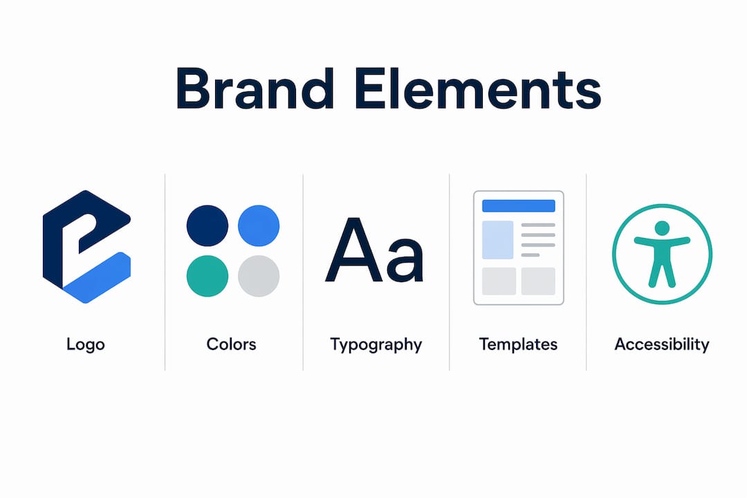
Knowing which assets to pull from your brand system, and how to adapt them for email realities, is where most teams lose consistency. Here is what belongs in every branded email and how to handle each one.
Logo
Place the logo in the header partial, coded as an <img> tag with explicit width, height, and alt text. Keep the display width between 150–200px for most desktop clients. Use a transparent PNG so the logo works on both light and dark backgrounds.
Color palette Your primary brand color belongs on the CTA button. Secondary colors work for dividers, background sections, and accent text. Always verify contrast ratios: WCAG AA requires a 4.5:1 ratio for body text and 3:1 for large text. Email clients cannot compensate for low-contrast choices the way a browser sometimes can.

Typography
Web-safe fallbacks are non-negotiable. If your brand uses a custom typeface, load it via a @font-face declaration in the <head> for clients that support it (Apple Mail, iOS Mail), and specify a system-font fallback (Arial, Georgia, Helvetica) for those that do not. Limit your font stack to two typefaces: one for headings, one for body. More than two creates visual noise and slows rendering.
Imagery and illustration style Maintain consistent photo crops, overlay treatments, and file formats across campaigns. Use JPEG for photographs and transparent PNG for logos or illustrated elements. Keep hero images under 200KB to avoid slow loads on mobile.
Tone and microcopy Your subject line, preheader, and body copy should all sound like the same person wrote them. If your brand is direct and a little irreverent, the subject line should not be formal and the body copy casual. Align these three elements against your brand voice guidelines before every send. A personal branding approach in email extends this consistency to personalization tokens and signature language.
- Subject line tone matches brand voice
- Preheader expands the subject, does not repeat it
- Body copy uses brand vocabulary and sentence rhythm
- CTA copy is action-oriented and consistent across campaigns (“Shop Now” vs. “Buy Now” — pick one and keep it)
- Signature includes brand name, reply-to address, and unsubscribe link
Pro Tip: Code your logo and footer as saved partials in your ESP. In Klaviyo, these become reusable blocks you drop into any template. One update to the partial propagates across every template instantly, so a logo refresh never requires touching 40 individual campaigns.
A good email style guide documents all of the above with email-specific rules: approved logo sizes, fallback fonts, and a template per email type. Without it, brand drift happens gradually and is hard to catch until the damage is visible.
Layout patterns and modular templates that keep every campaign on brand
Template choice is a brand decision as much as a design one. The layout signals how much information you are delivering and how much you trust the subscriber’s attention.

| Template type | Best for | Mobile behavior | Brand complexity |
|---|---|---|---|
| Single-column newsletter | Content-heavy sends, editorial | Naturally responsive | Low; relies on typography |
| Hero + body promo | Promotional campaigns, product launches | Hero stacks above body | Medium; image-dependent |
| Transactional / receipt | Order confirmations, shipping updates | Clean stack | Low; functional first |
| Modular component-driven | Lifecycle flows, multi-product | Flexible; blocks reorder | High; requires a component library |
The modular approach is worth the upfront investment. Reusable modules reduce design drift and speed campaign production, because your designer is assembling pre-approved components rather than rebuilding from scratch each time. A standard component library includes: a header partial (logo + nav), a hero block (image + headline + subhead), modular content blocks (text + image, text-only, product card), a CTA row, and a footer partial (unsubscribe, address, social links).
For personalized email templates in lifecycle flows, the modular system pays off most. A welcome series, an abandoned cart sequence, and a post-purchase flow can all share the same header and footer partials while swapping only the hero and content blocks. The subscriber sees a consistent brand; the team ships faster.
Starting from a tested template rather than coding from scratch also eliminates a category of HTML email bugs that only surface in specific clients.
Technical constraints that keep on-brand designs reliable across inboxes
Email is not the web. Developers who apply standard web techniques to email campaigns will break them in predictable, frustrating ways.
The most important constraint: table-based layouts remain the industry standard for cross-client reliability. Outlook on Windows uses Microsoft Word’s rendering engine, which strips Flexbox and CSS Grid entirely. A two-column layout built with display: flex will collapse to a single column or break completely in Outlook. Tables are not elegant, but they work everywhere.
Image handling rules:
- Use inline images (hosted URLs in
<img>tags), not background images for critical content - Background images fail in Outlook; any text or CTA placed over a background image becomes invisible there
- Always write descriptive alt text so the message communicates even when images are blocked
- Use transparent PNGs for logos; a white-background PNG on a dark-mode email looks like a white box
CSS in email:
Inline your styles. Many clients strip <style> blocks in the <head>, so style="font-family: Arial, sans-serif; color: #333333;" on the element itself is safer than a class-based rule. Media queries in the <head> still work for clients that support them (Gmail app on Android, Apple Mail) and are the right place to handle responsive column stacking. Use them defensively, as a progressive enhancement, not as the primary layout mechanism.
Accessibility basics:
Set a minimum font size of 14px for body text and 16px for mobile (via media query). Tap targets for CTA buttons should be at least 44px tall. Use role="presentation" on layout tables so screen readers skip the table structure and read the content directly.
Pro Tip: Build your header, footer, and CTA row as pre-coded, tested HTML partials stored in your ESP or a shared code repository. Paste them into new templates rather than rebuilding. This eliminates the most common source of brand breaks: a developer who codes the footer slightly differently each time.
Dark mode testing deserves its own step in every QA process. Apple Mail, Gmail on iOS, and Outlook on Mac all offer dark mode, and some force color inversions that can make light-colored text disappear against a dark background.
Testing and QA to verify brand consistency before every send
A beautiful email that breaks in Gmail is not an on-brand email. QA is where brand consistency gets confirmed or lost.
The recommended QA cadence runs in four stages: developer preview in a browser, automated inbox previews, a staging send to a seed list, and final approval sign-off. Skipping any stage increases the chance that a brand break reaches subscribers.
Stat to know: Automated inbox previews and deliverability checks are standard QA steps for reliable branded sends, catching client-specific rendering issues before a wide send.
Priority inboxes to preview:
- Gmail web (Chrome)
- Gmail mobile (iOS and Android)
- Apple Mail (macOS and iOS)
- Outlook 2016/2019/2021 on Windows
- Corporate Outlook environments (often the strictest rendering)
Litmus and Email on Acid both generate screenshots across 90+ client and device combinations in minutes. Run these before every campaign send, not just for new templates. A client update (Gmail changed its rendering behavior in 2024) can break a template that worked fine last month.
QA checklist per send:
- Logo renders correctly; alt text is present
- CTA button color matches brand spec; tap target is at least 44px
- Preheader and subject line are aligned in tone and do not repeat each other
- Unsubscribe link is visible and functional
- UTM parameters are consistent across all links
- Dark-mode pass: text is readable, logo has no white box artifact
- Spam check passes in Litmus or Email on Acid
A fast workflow for sending an on-brand email in 60–120 minutes
Speed and brand consistency are not opposites when you have the right system. Here is a time-boxed process that works for in-house teams and agency-assisted builds alike.
- Brief and goal (10–15 minutes): Define the campaign goal, audience segment, and one primary CTA. Assign roles: who writes copy, who assembles the template, who approves.
- Select template and components (10–20 minutes): Choose the right layout from your template library (single-column, hero + body, modular). Pull the header, footer, and CTA partials.
- Assemble content (15–30 minutes): Drop in copy, images, and personalization tokens. Verify subject line and preheader tone against brand voice guidelines. For ecommerce brands on a tighter budget, this is where a solid template library pays for itself.
- QA and previews (15–30 minutes): Run Litmus or Email on Acid previews. Complete the QA checklist above. Do a manual dark-mode pass.
- Schedule and send (5–15 minutes): Set send time, confirm audience segment, and schedule in Klaviyo or your ESP. Log the send in your campaign tracker.
In-house teams with a component library and brand guidelines in place can reliably hit the 60-minute mark for standard campaign types. Agency-assisted builds, where a partner handles template coding and QA, typically add a review round but reduce the risk of technical brand breaks. An ecommerce marketing checklist can help teams track these steps across campaigns without missing a brand-consistency gate.
How to measure whether your emails are actually on brand
Measurement for on-brand email design works at two levels: performance KPIs and qualitative brand checks.
Performance KPIs to track:
- Open rate: A proxy for sender recognition and subject line relevance. Consistent branding lifts this over time as subscribers learn to trust your sender name.
- Click-to-open rate (CTOR): The ratio of clicks to opens. This isolates design and copy effectiveness from deliverability variables.
- Conversion rate: The percentage of recipients who complete the desired action. For lifecycle campaigns, track repurchase rate and average order value alongside conversion.
- Retention and repurchase lift: For post-purchase and winback flows, measure the delta in repurchase rate between recipients and a holdout group.
Stat to know: Email ROI measurement for DTC brands improves significantly when CTOR is tracked separately from open rate, because it isolates the design and content variables that brand managers actually control.
Qualitative brand checks (monthly): Pull five recent emails side by side and ask: Do they look like they came from the same brand? Is the logo in the same position? Are the CTA buttons the same color? Does the copy voice feel consistent? This side-by-side sampling catches gradual drift that metrics alone will not surface.
A/B testing for brand variables: When testing brand elements, isolate one variable at a time. Test CTA button color against a neutral alternative, or test a formal versus conversational subject line tone, but never change both in the same test. Confounding brand variables with offer or audience changes makes the results unreadable. Run brand-variable tests on your largest, most stable segments to get clean signal.
How Take-action implements on-brand email design
Take-action’s process for building a branded email program starts with a brand audit and ends with a component system that the client’s team can use independently.
- Brand audit: Review existing email templates, brand guidelines, and ESP setup. Identify inconsistencies in logo treatment, color use, typography, and tone.
- Component system build: Create a library of pre-coded, tested HTML partials: header, footer, hero, content blocks, and CTA rows. Each component is tested across Litmus and Email on Acid previews before it enters the library.
- Template builds: Assemble campaign and flow templates from the component library. Templates cover the core use cases: promotional campaign, newsletter, welcome series, abandoned cart, and post-purchase.
- Flow setup in Klaviyo: Map the component-based templates to automated flows. Welcome, cart abandonment, and post-purchase flows each get a template that shares the same header and footer partials, so brand consistency is structural rather than dependent on individual designers remembering the rules.
- QA with Litmus and Email on Acid: Every template goes through automated inbox previews and a manual dark-mode pass before it goes live.
The outcome of this process is a system where brand consistency is the default, not the exception. Teams send faster because they are assembling, not building. Brand drift is caught at the component level before it reaches subscribers. Cross-channel brand consistency becomes easier because the email component system documents the brand rules in a format the whole team can use.
Key Takeaways
On-brand email design requires a component system, technical discipline, and a QA process that treats brand consistency as a measurable output, not an aesthetic preference.
| Point | Details |
|---|---|
| Define on-brand email design | Visual and verbal brand alignment across every email, verifiable in 30 seconds with three checks. |
| Build a component library | Reusable header, footer, and CTA partials eliminate design drift and speed every campaign build. |
| Respect email’s technical limits | Table-based layouts, inline CSS, and transparent PNGs are non-negotiable for cross-client reliability. |
| Test before every send | Run Litmus or Email on Acid previews plus a manual dark-mode pass on every campaign, not just new templates. |
| Take-action’s approach | Take-action builds component-driven Klaviyo template systems with Litmus/Email on Acid QA baked into the process. |
The pitfalls most teams hit, and how to avoid them
The most common mistake in on-brand email design is over-designing. A template with five font sizes, three background colors, and animated GIFs in every section is not more on-brand than a clean single-column layout. It is harder to maintain, more likely to break in Outlook, and slower to load on mobile. The brands with the strongest email recognition tend to have the simplest, most consistent templates, not the most elaborate ones.
Relying on background images is the second most predictable failure point. Outlook will not render them, which means any text or CTA placed over a background image simply disappears for a significant portion of corporate email users. The fix is straightforward: use a solid brand-color background coded in HTML, not an image.
Dark mode is still underestimated. A logo saved as a white PNG on a transparent background looks fine in light mode and becomes invisible in dark mode. Transparent PNGs with a visible logo on any background color are the correct format, and a dark-mode preview should be a non-negotiable step in every QA pass.
On the copy side, the most common pitfall is inconsistent CTA language. “Shop Now” in one campaign, “Buy Now” in the next, “Get Yours” in the third. Each variation is a small brand signal that says the team is not paying attention. Pick the CTA language that fits your brand voice and standardize it in your style guide.
The handoff between design, copy, and development is where brand breaks most often originate. A designer who exports a Figma frame without specifying fallback fonts, or a developer who codes a CTA button in a slightly different hex value, creates drift that compounds across campaigns. A shared style guide and a component library with locked values are the structural solution. The QA checklist is the catch-net.
Great design paired with irrelevant content will not save an email program. Recognition and trust get the email opened. Relevance is what earns the click and the repurchase. Both matter, and neither substitutes for the other.
Take-action builds branded email systems that scale
Most ecommerce teams know their brand guidelines. The gap is between knowing them and having a system that enforces them at speed, across every campaign and flow, without requiring a senior designer to review every send.
Take-action builds that system. The agency starts with a brand audit, builds a component-driven template library tested across Litmus and Email on Acid, and maps those templates to Klaviyo flows covering welcome, cart abandonment, and post-purchase sequences. The result is a branded email program where consistency is structural: the right logo, the right colors, and the right voice appear in every send because they are locked into the components, not dependent on individual memory.
This approach works best for ecommerce brands that are already sending but seeing inconsistency across campaigns, or teams that need to scale sends without scaling headcount. If your emails do not look like they came from the same brand, or your team spends too long rebuilding templates from scratch, Take-action’s email marketing services are the practical next step. Book a discovery call to see what a component-driven system would look like for your brand.
Useful sources and tools for on-brand email design
The tools and references below cover the core needs: inbox testing, HTML best practices, and brand guidelines.
Inbox testing platforms
- Litmus: Automated previews across 90+ clients, spam testing, and brand guidelines guidance. Use for every campaign before send.
- Email on Acid: Similar preview coverage with strong accessibility checking. Particularly useful for catching dark-mode issues.
HTML and coding references
- EmailBits HTML Email Design Best Practices: Practical coding guidance covering table layouts, inline CSS, and cross-client compatibility.
- Benchmark Email Design Best Practices: Covers dark mode, image handling, and mobile optimization.
Brand and content strategy
- Mailmodo Email Branding Guide: Covers the balance between visual branding and content relevance.
- Take-action Blog: Practical guidance on aligning email with broader digital brand identity.
Trust signals and ecommerce context
- EcomEye: Product Page Trust Signals: Useful for understanding how consistent design across email and product pages reinforces brand credibility.